Introduction
The first time I remember seeing a portrait photograph was of a woodpecker in the wild. In the photograph it had the woodpecker on a branch looking off into the distant . This particular photo was print and was placed on the wall in the classroom in Brazil . The photograph was one of a number of bird photograph but this particular one caught my eye . The reason it caught my eye was its beautiful colours on its wing and it long beak . Since then photograph has advanced in numerous ways such as, filters and better quality images .
|
|
|
What is a Genre?
A genre can be explained as a type of photography which is used to differentiate photos by their style. The concept of genres was first created by Plato who split literature into 3 genres Poetry, Prose and Drama. Genres in photograph are very similar to the genres in art, music and films. Some examples of genres are still life, landscape and portraits. Genres categorise photos but in some cases in photography we cross-over different genres and experiment the boundary's to them .
The Elements of a Portrait
Most portrait photographs are usually made up of four key elements :
- Face - facial expressions, hair ,face structure ect...
- Pose or structure - manner or attitude
- Clothing - Social class , sex , culture , fashion
- Location - Background , social scene of the person in the photograph
There are also sub-genre in portraits :
- Studio portraits
- Identification
- Self portraits
- Family snapshot
- Police mugshots


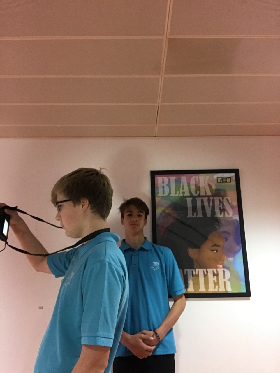
These four photographs where my first attempt at the sub-genres in photograph and this is what I produced. When trying to achieve these sub-genres I tried to make it look as new as possible but I ended up having similar photographs to my other colleagues because of the lack of space and time. If I was to achieve this again i'll make sure to get a wider range of photographs with different people involved. I most enjoyed the family snapshot as I was able to dress up my friends and take pictures of them and I think it turned out quite well. While framing these sub-genres I made sure to have a centre dominant frame for the police mugshot (the second photograph)as I though I would produced a distorted and hypnotic image as they both look the same and are twins. But unfortunately the boy on the right blinked just before the photograph was taken and if I was to recreate it I would make sure we had enough time to retake it.
|
|
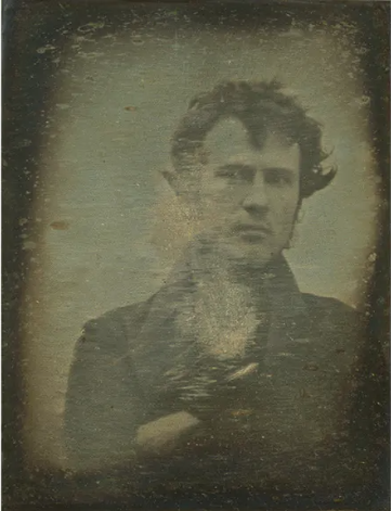
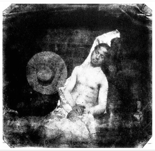
These two images are both considered some of the first ever portraits of there time .These images are both portraits of people in two totally different scenarios and two completely different times . These photos are both framed squared and this is most likely because of their cameras they used at the time . I think these photos were made with a Daguerreotype which was one of the earliest type of photographic processes. In the two photos they both have completely different backgrounds, for example in Robert Cornelius self-portrait his murky yellow background suggests his equipment was not advanced at all at the time . But Hippolyte Bayard self-portrait you can see a hat in the background and has a more clear concept then the earlier self portrait . The reason I think the colours of the self portraits is different because they were taken 1 year difference in time. An additional reason for this could be because of the concept of the self portrait . I think Roberts photograph is only of his head and shoulders because he had limited time to get in the right position but Hippolyte's has thought of how to position his photograph well.
3 picture timeline


|
2011- 3 years old
|
2015- 7 years old
|
2022- 14 years old
|
Niko Froehlich
Niko Froehlich is a self portrait photographer which photos environmental portraits and self-portraits in South London. His project was called South of the River and his photo are all around South London . We had a workshop today where we got to experimented his ways of photography with are 2 hour lesson. What i liked about Niko Froehlich's was how he captured the people he was photographing and kept them in their natural background. I additionally found interesting how he capture people in his local area when growing up which is my local area too. This meant i could see people in my local area which i havent seen before which is what i liked about his work. Out of all the photos i took i had to pick 5 photos that court my eye and i liked most . All these images in my opinion work well. But my favourite has to be the second photo where I've used the flash . This presented a distorted blurring photo which I think works really well . All these photos i took are portraits of people . They're all different people and they show their lives imbedded in in one photo . This is why environmental portraits fascinates me , the way they don't know your photographing them but you manage to capture the right photo at the right time. I also enjoyed taking pictures of people without them realised because it meant that they weren't changing their body shape and being natural to there true self instead of changing it.


Family Portraits
|
|
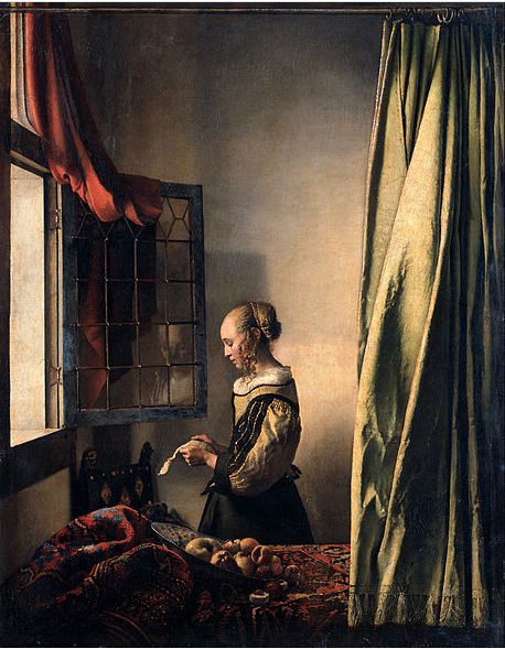
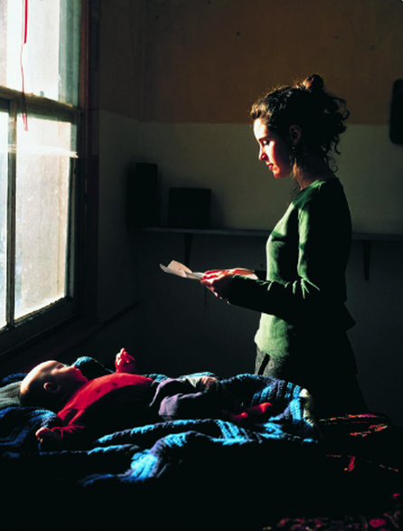
The photo on the left is an oil portrait painting created by Johannes Vermeer in the years 1657-1659 .The photo on the right is taken by Tom Hunter and was inspired by Vermeer's oil painting .The similarities between the photo is the composition of the two photo's .They are both looking into a letter but we don't know what this letter is .This really makes me think about the letter and the importance which it might hold. On the contrary, the differences between the two portraits is that the light hits the window at different angles. On the left the light if hitting her face dead on and could be during a sun set . But on the right the light is hitting at a high angle thought the window and is hitting her body and parts of the baby but the rest of the room is dark. I think Tom was influenced by Johannes Vermeer portrait because of the mysteries behind the painting , the window , the light hitting though the window ,the letter these all present confusion and mystery in the portrait which Tom Hunter wanted to recreate .
My attempt


These two images were taken 10 years apart from each other from when I was 4 all the way till Im 14 . To recreate these images I had to borrow my moms trousers and I used the exact camera that was used in the first photograph. I struggled with catching the right lighting and If I was to improve the photo I would make the open grass space bigger and making the photo have a higher exposer. An additional thing I would make better is turning the camera slightly to the left because in the photo I have the camera facing the wrong way . I am pleased with my final outcome because It shows how I've grown up through the years and through this recreation I have learned how hard it is to try and recreate a photo that was taken a decade ago when everything around you and yourself has changed.
Tyler Mitchell

|

|

|
These images are displayed in a way which captures my interest into the concepts behind these images. What I first thought when seeing these images was how they all looked like they are having a good time with a world of peace and love but then you think about the juxtaposition between Tylers utopian world and the one we live in , its sad to think about it but its the reality.
The different elements in Tyler Michell's work are fascinating to me because in the middle photo its of a black women who's in a world of artificial containment of nature . This present confusion to me because all his other photo are in the outside world but this picture is different . The connection of the photos is the way there all in the nature and of young black people .
The different elements in Tyler Michell's work are fascinating to me because in the middle photo its of a black women who's in a world of artificial containment of nature . This present confusion to me because all his other photo are in the outside world but this picture is different . The connection of the photos is the way there all in the nature and of young black people .
Tyler Michell Gallery and Day in London


Street Names


Photographers Gallery-Chris Killip


These photos were all taken during are school trip to the Tyler Mitchell exhibition near Bond Street. Additionally to the exhibition we got to walk through London taking photos of a specific subject and we also went to the photography gallery in Soho. As my subject I chose street names . These interested me because every street has a unique street name and there everywhere around us but most of the time we don't notice them . I struggled capturing the street name because we where constantly moving and we didn't get much time to stop and think about the composition of the image . However I enjoyed seeing the beautiful sights of London and the people around it which make the city what it is . When we got to Soho we were able to go into the photographers gallery and explore the different photographers art work in there . When we got inside one photographer really court my eyes for his consistent black and white photographs and the way he lays out his image , his name was Chris Killip . When we got back to school I was able to recreate some of Killips work . I took 10 photos but I narrowed it down to 6 because I thought these really captured what I was going for . I then edited the photos to make them black and white to really capture what Chris Killip theme was. I enjoyed experimenting with black and white because I hadn't tested it before .
Portraits in Photograph-Breaking the Convention
We had a challenge to chose two photographers from the Tallis photography Face Value page and look through his photography page, analysis the photos and talk research the photographer . My first photographer I chose was Lee Friedlander and the second photographer I picked was Trish Morrisey.
Lee Friedlander


My attempts...


Lee Friedlander was an American photographer and artist who was based in New York and California in 60s and 70s . Growing up in Washington was tough his mother died when he was seven but this didn't stop Friedlander. He had a very artist mind which enabled him to go on to study photograph at the Art Centre Collage of Design at the age of 18. After he finished collage he moved to New York in 1956 where he shifted his focus to urban photography . He did this by adding components into his work to make it look of modern life. His equipment was very basic with a hand-held Leica 35mm camera and black and white film .He did this because all of his images where taken during motion and he only had seconds to capture the right shot, he didn't have time to set anything ups he just had one chance and that was it .Thats what drew me towards his photography the way he gets the perfect image when he only had a split second to take it really impresses me. Additionally the way all his photo are in black and white presents a consistency throughout his work .The framing within his photograph is really impressive. For example with the first photo the background is framed really well the door/door frame presents a second frame in the photo where the man is standing . What also interests me is with the door and the man that all the colours contrast each other . For example his white suit juxtapositions the black door however the white door frame really makes the white suit pop out .When trying to recreate Friedlanders work I tried to split his photos into three parts these parts were black vs white , body composition and location. I chose to do this as I thought it would help me become more able to understand his work and capture it like he did. Firstly I looked at the location and what I chose to do was use photos I took from three different city Paris,London and Amsterdam . I subsequently did this because Friedlanders work was all taken I big cities such as New York. I then looked at body composition because that's what makes Friedlanders work what it is ,the people around and in the photo. I especially like the people in the photo on the right as this was taken during the annual pride march in Amsterdam and it showed these people all dressed up. Additionally, I liked the matching umbrellas as I thought it made the photograph come to life. Finally, I looked at black vs white where after I had collected my photographs I chose to edit them to mono which is a shade of black and white which I thought enhanced the different elements to the photograph .
Trish Morrissey


My attempts ...


Trish Morrissey is a Dublin based visual photographer who focuses her work on family heritage and archival materials . Morrissey is one of the leading women photographers today and has had her work published in the guardian and exhibitions in Finland. Morrissey presents a cross over with reality and fantasy as in her photos she presents different roles such as the family member , historical figures and even strangers .But when she incorporates this she is always the protagonist in her photos. I chose to pick Morrissey because I liked the continuity in her photos it presented comfort and the way that Trish is always the protagonist made me feel more connected to her pictures. In her pictures she incorporates different levels in her picture for example in the photo to the right she is kneeled down but on the contrary the rest of the pictures are of her standing up . What additionally drew me towards her photos was the way she positioned her camera, her camera is always positioned in the centre. This presents Morrissey's face as the main subject and what we draw are eyes to immediately when we see her photos. Her picture differentiate from Friedlander's because she uses colour in her photos and their highly exposed so you can't see every colour in the photo. I attempted to recreate her photos remembering how she composed her photos and making sure there similar to hers. I composed my images by using a 10 second timer and positioning myself correctly where I wanted myself in my photo . I changed her way of taking the photographs by angling my camera at a low perspective. I did this because I wanted to differentiate my photographs from anyone else's. Furthermore I changed the colours brightness of how she does her photos, I edited all my photos to a vivid warm filter because I liked how it changed my surroundings to a calm setting .
The Relation Between Art and Photography
|
Today we had a photography task to recreate, famous artists work with what we had around. I worked with my friend with this task and we recreated 'Ophelia' by John Everett Millais 1851-52 and 'April. Restless' by Jennifer Packer. We collaboratively chose these especially because we liked the overly exposed yellow on the man and we had to take upon the challenge . We also liked the colours in Millais painting and we saw the vibrant fabrics in the box and thought we could make a really good recreation of it. However it was really hard when we came to the editing of these photos as its hard to recreate the right exposure, saturation and components to make it as similar as it possibly can be. For example Packers work was a water coloured painting and we struggled to recreate that well. When i recreate this i'll try and make sure I can incorporate all the different objects in the back such as the keyboard and flowers . Additionally with Millais painting I will next time try to be outside as I was limited to an inside space.
|


|


|
Using light to recreate paintings
We then had a workshop of how we can position light. We got taught about the soft box which softens the light and layers of diffusion which diffuses the light to make it less exposed. We then tried to reposition the angle of the light such as having it over shadowing the subject called top light and angling it either left or right to light half of the subjects face called front and back light. We had a lesson on main light which is called key light because it focuses the subject in the scene.


Alternative Portraits
Many photographers these days are breaking away from the typical 'rules' that should be followed about taking a portrait and are shifting to new adventures ideas and meanings behind their photographs. This is a very interesting topic because most photographs are different and they can portray different cultures and visions. When introduced into alternative portraits we were set a challenge to pick two photographers from the Thomas Tallis Face Value page and write about them and recreate them. After we achieved this we picked one specific photograph we took and manipulated them by hand and with photoshop. The two Photographers i picked where Gordon Parks and Rhiannon Adam.
Gordon Parks
- Busy streets
- Blurred background
- Vibrent red roses
- Illusive subjects
- Haunted shadows
|
Gordon Parks is an American photographer who took a wide range of photographs over his career but the photographs above are part of his coloured exhibition. In the photograph I can see 4 males and a female all laughing and having fun together behind a jaw dropping view of New York. In this photograph you can see that the subject is the people because they are centrally positioned in the image but behind them the buildings and even two of the people are all blurred.
The blurred subjects presents a haunted and desolate feeling about the photograph and gives a feeling that their joy in the photo could be evil and not genuine. The distorted image could represent the utopia that New York is and how everything in the image looks happy but really, its not. This photograph is a still life photograph and reminds me of a video game based in New York with these people as the protagonist. Although this photograph is still life its looks very fake to me and because of this haunted felling it makes it feel unnatural. |
My attempts...


Manipulating by hand ...


Manipulating with photoshop...
1)Colour
When manipulating by photoshop I first of all tried altering the photos colour and adding elements to it to make it look more abstract. I achieved this by first going to the image button at the top, and this gave you a selection of things to do such as image cutting and trimming ect. After looking i picked adjustments and this gave me a wide range of options to edit my image. Because i was editing the images colour i selected hue/saturation and this meant i could select sections of the image and edit it whatever colour i wanted. When doing this i made sure that i kept a wide range of colours around the image so it didn't look repetitive. It was challenging at the start because i didn't understand how photoshop worked so i had to learn which toojk a long time but in the end i got used to it.


2)Texture
When manipulating my photos we tried to change the texture of the photo with editing it in photoshop. Attempting to do this was a challenge because i didn't really understand how to change the texture of the photograph but what i did was went to filter at the top and this allowed me to substitute many textures which alter the photograph. After discovering this i had a wide range of options to chose from so i started to experiment different ones. Eventually I chose noise which gave it a cctv like approach. I thought this worked really well with my photograph because it was taken on the top deck of a bus. This high level means i'm looking down of this women and it looks similar to a cctv camera in real life.


3)Layering
Another way to to manipulate images is by layering. This is done by adding elements on top of an image. I did this in this image by taking the main component of the women and distorting her in some way then layer it back onto the image. With my image i tried further distorting it by changing its blur. As the women got bigger i made her more and more blurring this made it hard to depict who it is and presents a hidden aspect to it. What i thought was effective was the repetition of the women and how she consistently got bigger. However this did make the image feel clustered in a way.


4)Cutting
When we further manipulated this image i tried a new way of manipulating the image and that was with cutting. Cutting the photo consists of cutting a part of the image about and changing or moving it to a new place. This makes the image look contorted. What i did was split the image into three section and kept the person as the focal point of the image. Then i moved the bottom and top sections around and this was done by cutting section of the ground and moving it to the top of the picture while doing the same with the sign at the top. What i liked about this was how the sign around the women gradually got smaller to fit around her body. But if i were to improve this i would make the top section of the image more intresting.


Rhiannon Adam
- Secretive subjects
- The sun is hitting the window onto her face
- loneliness
- Covering her face
- Escaping?
|
Rhiannon Adam is a photographer from Cork, Ireland and focuses her work on lifestyle and her childhood. In this photograph you can see the reflection of this women's face while she sits on a London train. The subject of the women is portrayed as secretive because she's facing the other way and her head is covered with a hijab and a mask on her face. The photograph to me is presented as if she is running away from something and doesn't want to expose her face in case she gets found out. I find this photograph interesting because the rest of the photo is blacked out and the only things you can really see is her head and the chair which is highlighted by the sun beaming down. What I like about this photograph is that we get to see the reflection clearly because it juxtapositions the way see looks out the window and makes me think that as much as she tries to hide away she will always be seen. I think this photograph has a deeper story than just from this image and that's what interested me to pick it .
|

|
My attempts...


Continuing to Manipulate Portraits


After manipulating are photos via photoshop we then tried manipulating some self portraits by hand. This was difficult because if you made a mistake you cant change it you just have to restart or change your idea whereas you can press the back button if anything goes wrong in photoshop. This meant i had to be accurate when cutting or sticking anything onto the paper. When doing this we were able to have access to the printer and change the colour of the original piece. I put this to my advantage and with the picture on the left i used purple and green versions of my self portrait because i thought they went well. I then started cutting curtain elements to the picture and changing them to green because the purple version was my background. With doing this i didn't want to overdo the green and tried to make it balance but now looking back at it in think a bit of green in the bottom right corner was needed. For my second piece on the right i just used a coloured version and a smaller black and white version and overlapped them.
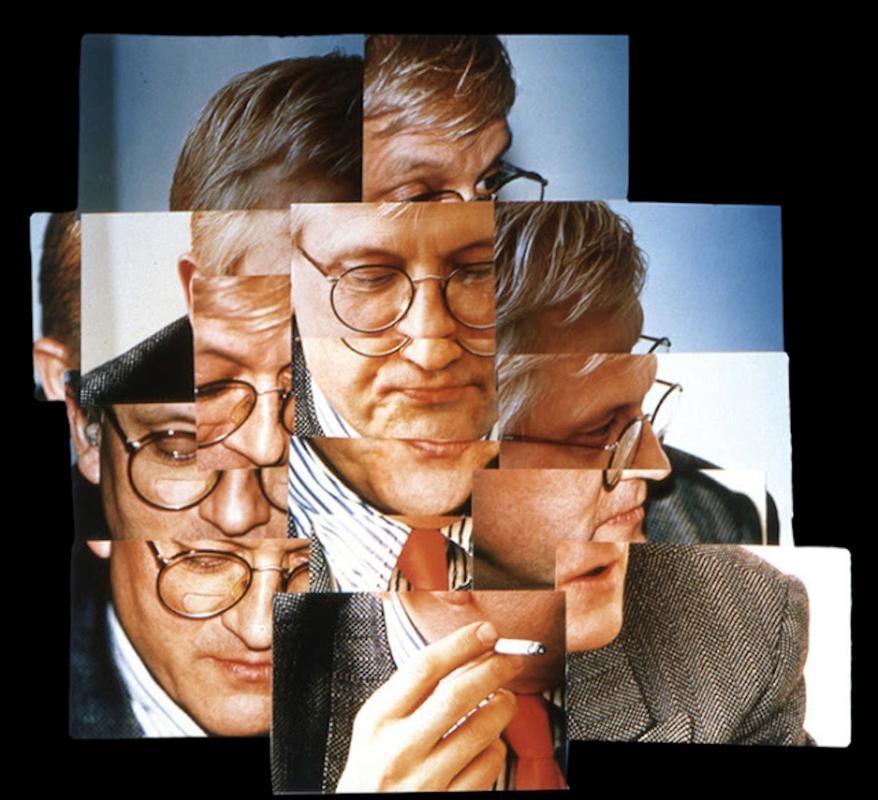
Photo Joiners-David Hockney
|
David Hockney is a well renowned artist and photographer who focuses on pop and modern art. David was born in Britain spending most of his life here before moving to California in the USA. Although David is most famous for his vibrant colored artwork he has still produces photographs time to time. In 1980 David produced many photo colleges which he called 'joiners'. This type of photograph is done by taking multiple photos from the same location but moving curtain elements to change it. After that you take you collection of photos and you can layer them over each other making it look contorted in a way. This can be done by hand or on photoshop. What i like about Hockneys photographs is that their different to anything i've seen before. This makes me interested to try and learn how to do this new technique. What i don't like about them is that you are limited to what you can do. You have to stay in the same place and you cant move location otherwise it looks like your using different picture and doesn't have the same effect.
|
|
My Attempts...


When we got given the task of recreating some photo joiners inspired by David Hockney we had to try two ways to make them. One of the ways was using photoshop and the other way was making it by hand. The photo on the left was taken by photoshop and was done by using multiple layers to over lap on to one stationed image. However the one on the left was made by hand and i had to cut out out specific part and organise them over each other.
Hannah Lenz
|
Hannah Lenz's portraits of 'Else' are a selection of portraits of a 97 year old women on her birthday called Else. I like this selection of portraits as she said herself that even though its her birthday it still feels like any ordinary day. It shows how birthdays change when you get older and this is a good representation of it in portraits. What I'm trying to tell you is that when your younger your birthday is the best day on the year. You get new presents your friends and family come round and they all celebrate your day. However when you get older its less appreciated and people don't praise you as they used to. It shows a contrast of emotions just from a selection of portraits. The aspects that I like from this portrait is that the photograph is sort of split into two, light and dark. This photograph is affective because the light is representing her emotions in a way as they are fading as she gets older.
|
|
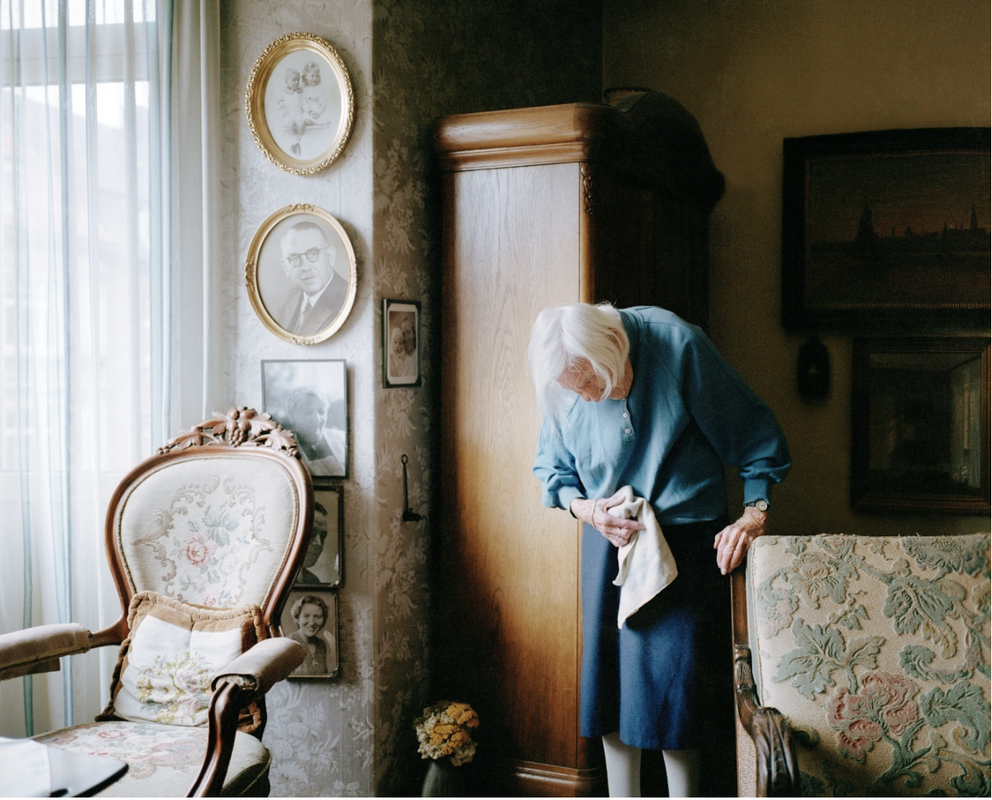
Julian Germain
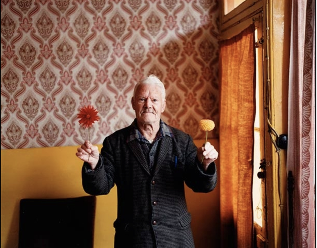
|
In 2005 Julian Germain published a selection of portraits of a man called Charlie Snelling who lives alone in a house in Portsmouth. Hearing that he lives alone you might think he's lonely or depressed but he's neither. David is actually very happy and says that all he needs is his picture of his wife who passed away many years ago. This is amazing to me because a single picture holds so much meaning to Charlie and is keeping him going. As for the picture on the left I like how Germain has made him hold two flowers one yellow and the other red. These matches the décor and wallpaper behind him which in someway connects him to that. I also like how Charlie's head is centrally dominant and is the first thing we see when looking at the picture. This presents a image of his emotions and facial expression.
|


