Fragmentation
/ˌfraɡm(ə)nˈteɪʃn,ˌfraɡmɛnˈteɪʃn/
noun
/ˌfraɡm(ə)nˈteɪʃn,ˌfraɡmɛnˈteɪʃn/
noun
- the process or state of breaking or being broken into fragment.
"the fragmentation of society into a collection of interest groups"
Why I chose fragmentation?
I chose fragmentation for my personal project as I really enjoyed the idea of not being limited to a specific narrow theme. Fragmentation is a very broad topic as you are able to branch off into many ideas and sub themes within the idea of fragmentation. I am also yet to do this in my GCSE and I want to explore and experiment with breaking and redeveloping into a new pieces of work.

Marilyn Henrion


Marilyn Henrion is a New York photographer who uses her aesthetic vision to express her love for her urban geometry. She uses a textile based geometric abstraction and mixes it with a more modern approach. For me I love the way she cuts her images into smaller sections of many images of buildings or offices and places it in a unique geometric pattern to create a new image, a bit like a collage. What I like most about her pieces of work is that she exploits very strong and vigorous colours from different buildings and puts them together to make her images stand out. She also uses black and white images that show a contrast from very colourful constructs to more subtle and calming juxtaposition. Additionally i like the use of structures in her work as she uses a continued theme throughout the pieces and this creates continuity and repetition. However you could view her pieces as quite scattered and disorganised in some of her work as the colours don't match, some images overlap and overall it fells like there is no purpose. However I would disagree with this as I think she has purposely done this so we look at each cut out section of images individually rather then as a whole.
My response...

|
This is my first response to Henrion's work and here I tried to replicate the way she uses a collection of cityscape images to create a collage. I did this differently however as instead of taking the cityscapes myself I went on Google Maps and went around famous cities and choses interesting landscapes to screenshot and print off. The cities I chose was my home town London then Tokyo, Amsterdam, Berlin, Hong Kong and New York.
When I was arranging the images together I originally didn't take the sky out of the images and it looked very spread out and wasn't very effective or nice to look at. So then I changed it by using a scalpel to cut out the sky. Then I rearranged them again and this time it was what I was looking for. I think this attempt was more affective as the focus was very predominantly buildings which is what I was looking for. However if I was to improve my piece I would make sure there is less white gaps between the images as it breaks it up and feels more isolated which isn't effective in a collage |
Further response...

|
After I had constructed a bunch of landscapes together into a piece inspired to Henrion I wanted to develop it further. I achieved this by contrasting the colours on photoshop. This was very easy to achieve on photoshop as it was very repetitive however it was very fun to manipulate my work by photoshop instead of by hand as i was able to be more precise with my lines and inevitably made it come out with a cleaner finish. I achieved this on photoshop by selecting a specific part of the image and then going to Image -> Adjustments -> Photo Filter. This then sent me to a range of colors to chose from andI was also able to change the density of the colors.
After I had worked out the concept of how to change the colours and the densities it was a very repetitive process however each time I tried to change the colours so it looked different each time. I used a continuation of Henrion process in which he split his constructs in half and edited it to black and white. I followed this process and edited it into black and white, however with his work it differed as his half way split was a very straight line but mine was more rigid. This presented more of a cross over in my eyes as some of the colour was splurging into the dullness of black and white.
Additionally with Henrion's work he uses much more subtle colours however my piece has very saturated colouring. This was done to show the contrast between very dull and dark colouring mixed with highly intense colours merged together. This merger was achieved with the over lapping seen in the middle of the piece where it almost acts as a battle of power in colour and it is very even in this sense. This further developed piece worked very well and I was very pleased with it however if I continue this I would have less black and white to show the saturated colours taking over. |
Laura Letinsky


Letinsky is a Canadian photographer who is known for her psychologically loaded and deconstructed still life photographs. Some of her more recent work explores the themes of nature and collages. Letinsky stated that to her a 'collage' was "a term used to describe artwork that is assembled with images/objects". What I like about Letinsky's work is the way it explore fragmentation and the subjects of different themes and brings them together in a three-dimensional space. Additionally I think the way she integrates two-dimensional images into three-dimensional area is very unique which I haven't seen before. She manages to extract images into new way to create an embodiment of a collage very effectively. Furthermore she uses overlapping of images a lot which creates a story being created and thought through.
In her images it seems that they are predominately made up of sections from magazines which is very effective in her work. She uses very obstruct and random images and cuts the out from magazines and collates them into a new construct. When I attempt my own version of Letinsky's work I will try to follow her use of magazines. However if that isn't possible to collect I will try to use newspapers instead as it is a good alternative to use but will lake the same material used.
In her images it seems that they are predominately made up of sections from magazines which is very effective in her work. She uses very obstruct and random images and cuts the out from magazines and collates them into a new construct. When I attempt my own version of Letinsky's work I will try to follow her use of magazines. However if that isn't possible to collect I will try to use newspapers instead as it is a good alternative to use but will lake the same material used.
My response...


This was my first response to Letinsky and how I approached this was choosing very colourful and abstract images and using a scalpel to cut them out. This process was very time consuming and took a while to precisely cut the right sections out. Once I had cut out these specific objects, people or places it was time to arrange them into a specific way to create a new picture. This was very interesting to play around with however it was quite a struggle to overlay into a correct pattern or structure. I was very interested with playing around with the women who looked like they are picking up something. I played around with what she was holding and made it purposeful. Additionally I tried keeping my specific sections very compact as this is similar to Letinsky's process of arranging images. This was done to further create a meaning behing my work and I think it turned out reasonably well for the resources I had available.
However if I was able to redo this work I would have liked to have a broader range of objects so that I was able to explore more concepts. For example my constructs haven't got a hidden meaning behind it and I think it takes away credibility from my work. Furthermore I would have liked to try use magazine's or newspapers to create my images as there would be broader concept available and the images meaning could be developed easier.
However if I was able to redo this work I would have liked to have a broader range of objects so that I was able to explore more concepts. For example my constructs haven't got a hidden meaning behind it and I think it takes away credibility from my work. Furthermore I would have liked to try use magazine's or newspapers to create my images as there would be broader concept available and the images meaning could be developed easier.
Further response...

|
While I was thinking of how I could further develop my work I really wanted to use a magazine or newspaper to create my piece as the broad concept would help to create new meanings really well. So as I was looking through my books sections I found a french magazine which I picked up at the airport on my trip to Paris I thought it would be perfect to use so I scanned through it and selected very different and interesting bits to use. Once I had selected an array of parts I took the magazine into school where I then used a scalpel to cut out these sections.
Once completed it was time to arrange these parts. This part was very fun as I had the ability to change what the purpose was for each collection of images. I was really interested in using the cut out suit to give the faces a body and a structure. I think it worked out very well and was much better then my first attempt at Letinsky's work. |


Photo walk
These collection of photos were taken on a walk around central London (Soho area mainly) with my dad. With the objective of taking photo's of structures I wanted to have a set focus on two things: lighting and windows. I thought this was a good thing to focus my photos on as I could lead onto many thing in the future with. Widows is a good way to show fragmentation as you are able to show symmetry but also a fragmented change due to the lighting and objects through the glass. I am very happy with the result of my photos as I thought I followed the theme well however next time I go on a city walk i would like to photography people to break away from my consistent theme of buildings and structures.


Next steps mindmap...

Exquisite Corpses
I chose to develop my idea of exquisite corpses because I thought it was a very interesting pathway to go down and doesn't involve the theme of cityscapes as i've repeated that too many times. This idea is quite personal to me as when I was younger me and family would always play this game and I was always obsessed with it. This game was always played during Christmas times and it always brought our family together without having any technology around. It was a constant within my family however when all the children grew up the games sort of dissolved and was no longer played anymore. Thats why I thought it would be a good idea to bring this game back in my photography work.
The game originated from French surrealists who wrote originally wrote a story and the person beside them followed on after what they said. This was done to pass the time in cafes amongst friends and families in the 1930s. This then progressed to 'Picture Consequences' were creative surrealist artists drew portraits to express their artistic skills and talent. They originally separated the portraits into the head, torso , the legs and the feet.
Although this game is achieved by silly drawings I am going to change this into a photography focus by taking photo of people with interesting and unique fashions or facial structures. I hope to develop this further and use photoshop to bring people different components together and try change colours and tones to challange these themes and ideas.

|

|

|

|
These drawings above were created with the goal to create the similar drawings and process I did as a child. I achieved this with the help of my classmates where I would ask them to draw a specific section of the Exquisite Corpse then pass it onto my next classmate. These came out as I wanted them too as they were spontaneous. I didn't know what the final product would look like and the anticipation adds to the experience of drawing these silly portraits. Additional my classmates also enjoyed the freedom and the ability to draw whatever they wanted. One problem which did occur was the connection of each body part. This problem happened due to people not being aware of the connection lines. This wasn't a massive problem as the whole point was for the errors to add to the unpredictability however it did create an unwanted atmosphere taking away from the corpses.
Images to used...
After drawing the exquisite corpses it was time to collate photographs of my peers and people around me to use for my own creation of an Exquisite Corpse. This was relatively easy to do as I wasn't shy to ask my friends for photos of them. I collated around 20 photo all together and tried to involve different people each time. Additionally with this project I like the childish aspect towards it so that's why I occasionally asked my friends to do a silly or different pose to keep it fresh and interesting. However a lot of the time I was quite rushed to take the photo. This unfortunately meant I sometimes wasn't able to get a straight picture of them or they weren't centered. But this in fact added to the unpredictability of my Exquisite Corpses.


My responses
Once I had assorted and printed my images of people I was very excited to start constructing my Exquisite Corpses. I achieved this by cutting my images into 3 sections: head, torso and legs with a scalpel. I repeated this with all my images and then tried organizing them all together. I made sure to focus on lines and trying to connect each section together effectively that the images looked natural one instead of all messed up together. I was quite pleased how these turned out due to the fact of them looking natural however I also thought each section complemented the other sections well toward creating a construct of different images into one. This process did in-fact take quite a while to create as I wanted to try and used different images each time, but on one occasion I repeated the torso image as it lined up perfectly with both images beside them. Next time I want to edit these images into more silly and abstract poses to keep the theme of childish drawings.
|
|
|
|
Further developments...


|
|
|
|
Silhouettes
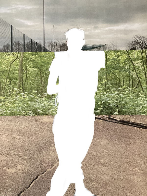
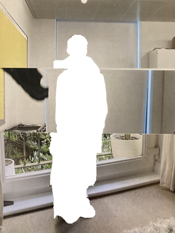
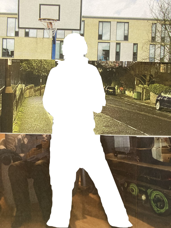
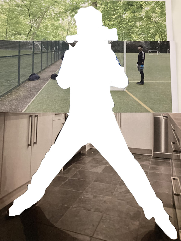
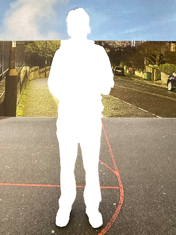
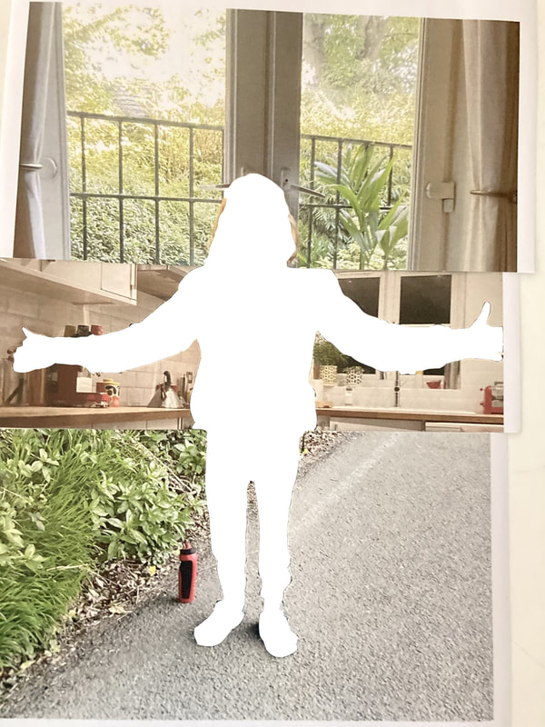
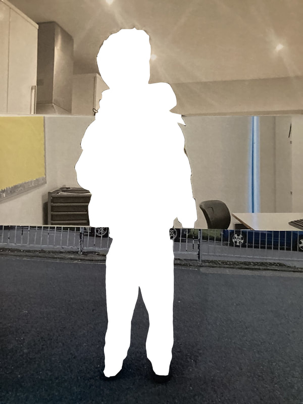
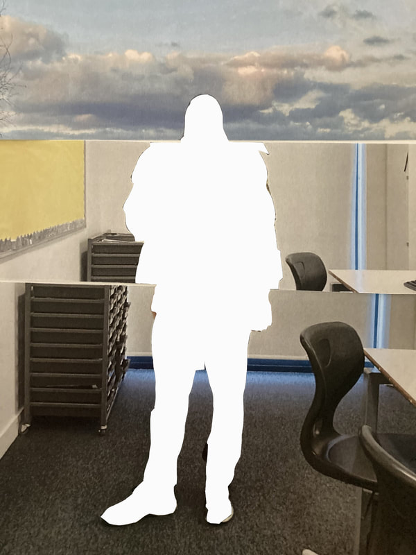
My next experiment was to keep the backgrounds of each Exquisite Corpse the same however removing the subjects/ people in the images and leaving a white silhouette. I wanted to do this so that people would not only focus on the background of the images and how they are put together to tell different stories but also making people question what was left behind previously. With leaving the white background it suggests something has gone missing or lost. Originally this was quite difficult as I was unaware of how to achieve these white silhouettes however once I had gotten the hang of it, it was relatively straight forward. On photoshop I used the magic selection tool to attach a selection around the outlines of the people. Once I had done this I used the brush tool to colour-in the selected area. However on certain sections the selection tool would misidentify the correct lines and would sometimes do off corse with its lines. But this was an easy fix and I was able to achieve this with a grate deal of accuracy.

|
|
|
|
Experimenting Light
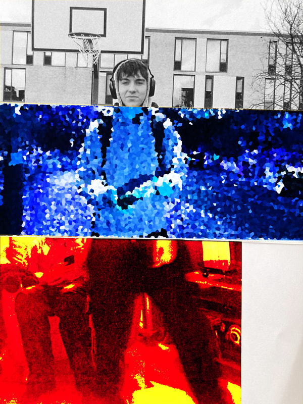
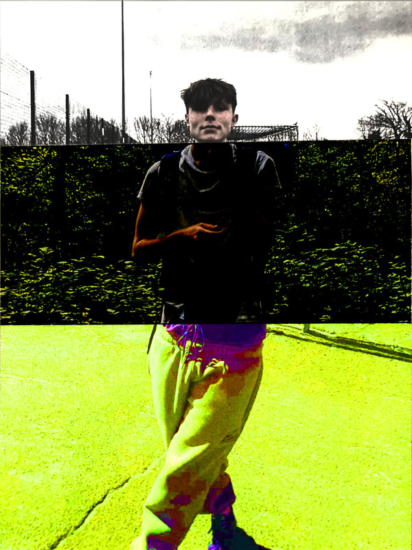
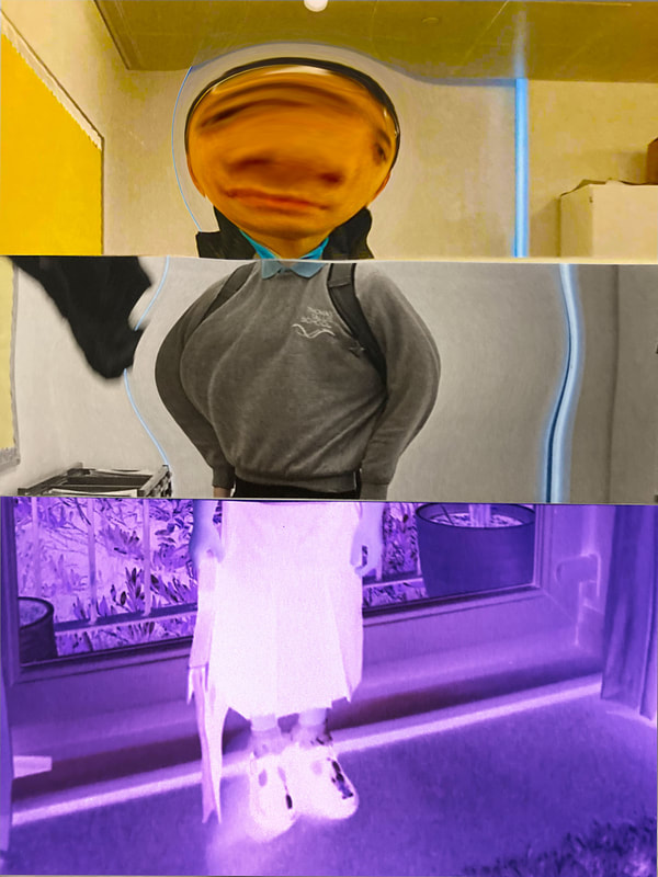
My next experiment was to test/change the lighting behind and surrounding my exquisite corpses. For this I had to cut out the background of my exquisite corpses and just have the main subjects in my images. I did this with a scalpel. Once I had done this I wanted to make a new collection of exquisite corpse as I thought it was getting quite repetitive using the same set of builds again and again. I made a collection of 4 new exquisite corpses and tried using bits I hadn't used yet to keep the new ideas of exquisite corpses alive. This was relatively easy but I also changed the amount of images used on one exquisite corpse. I varied it each time using 2,3 and 4 different images to create and exquisite corpse.
Once all exquisite corpses had been assembled I wanted to change the lighting of each ones. I did this by using a light underneath my corpse to expose the shadows and also changed the lighting behind the images. I did some as night, day and sunset to show the different lighting and how it would affect each image. My favourite one was the top right image due to the shadows being created behind. While varying the light I found myself struggling with how to change the lighting each time however I think I manage to show the different natural lights which surround the images.
Once all exquisite corpses had been assembled I wanted to change the lighting of each ones. I did this by using a light underneath my corpse to expose the shadows and also changed the lighting behind the images. I did some as night, day and sunset to show the different lighting and how it would affect each image. My favourite one was the top right image due to the shadows being created behind. While varying the light I found myself struggling with how to change the lighting each time however I think I manage to show the different natural lights which surround the images.


Katrien De Blauwer
Katrien De Blauwer is a Belgian photographer without a camera. Her work is commonly made up of collages of images she has gathered from magazine’s and assembled in three sections. Her work uses a range of different photographs such as portraits, specific objects and nature all brought together into a new piece of work. I found her work after I had finished my Exquisite Corpses and I thought was a perfect example of what to reference my work on. Blauwer's work differs from mine and she experiments with the collaboration of nature, humanity and physical objects. These brought together suggests a comparison and make the viewers intitaled to question the themes and message of her work.
I also like her use of colors in this collection as she contrasts black and white with when bold and bright colors. I think this was done to express the different sections and separate them from each other so they become more independent. Finally I love the way she choses to hide the eyes of people and replace It with another image. I think is questions the identity of these people and the masking of there personalities and true selfs. This could be a message to the patriarchal society we live in where women are pushed aside from any opinion or right.
I also like her use of colors in this collection as she contrasts black and white with when bold and bright colors. I think this was done to express the different sections and separate them from each other so they become more independent. Finally I love the way she choses to hide the eyes of people and replace It with another image. I think is questions the identity of these people and the masking of there personalities and true selfs. This could be a message to the patriarchal society we live in where women are pushed aside from any opinion or right.


My attempt...


With my attempt to recreate Blauwer's work I focused on the way she extracts the eyes from her subjects to create this sense of mystery. I also wanted to continue the use of women in her work as I think it establishes a consistent theme throughout the pieces of work. Luckily for me I used a French magazine which I collated my images from and in that was many inspiration STEM women who were used to inspire other younger women to join STEM jobs. I thought this was really useful as it was able to express how women have been belittled and looked as less qualified for a so called "man's job". Additionally I wanted to include an array of colors in my collages to make them bold and pop out to any viewers. This linked back to Blauwer's work as she similarly used very vibrant colors to contrast from the segregation of women.
Splitting up images
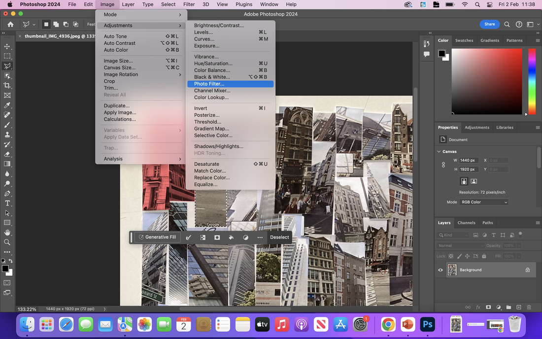
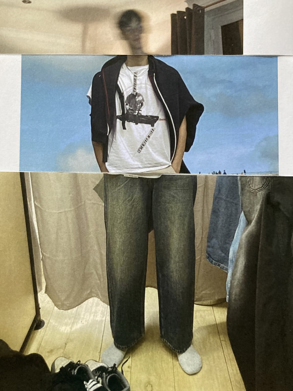
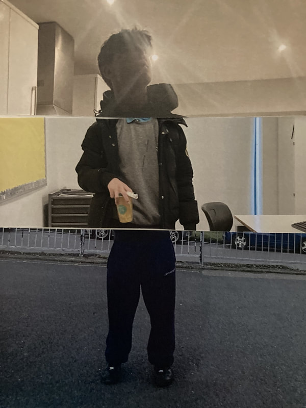
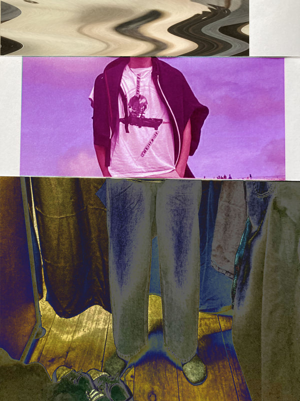
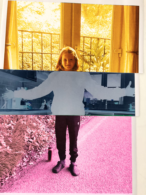
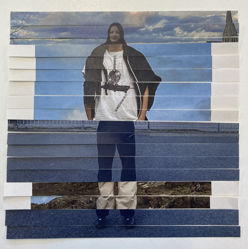
After I had split up my images into 3 bigger section I wanted to introduce a more detail reconstruction of my pictures being collaborated together. The first two images I chose where of the same person and I wanted them to have a similar build so that it can look as natural as possible. Luckily when I was photographing these two photos they were standing quite central in the image and where. at a similar distance from the camera each time. So this helped me when join the two images together. What I wanted to do was split my image into very small section and alternate each bits of the images one after the other. I used the roll cutting machine in our classroom to cut up the images into ruffly 5 cm each in size, however this was very hard to be precise in so had to be judged by eye. After achieving this I alternated each little section of both images one by one so I was able to get 2 pieces of work.
This process was relatively easy however I wanted to make sure that my lining of the two bodies was accurate to best it could be. Obviously this wasn't perfect but I tried my best to make them alined but also so the figure was visible at the same time. What i like about the outcomes is the differing colours visible as I have taken two completly different senarios and backgrounds and intertwined them together.
This process was relatively easy however I wanted to make sure that my lining of the two bodies was accurate to best it could be. Obviously this wasn't perfect but I tried my best to make them alined but also so the figure was visible at the same time. What i like about the outcomes is the differing colours visible as I have taken two completly different senarios and backgrounds and intertwined them together.


|


|
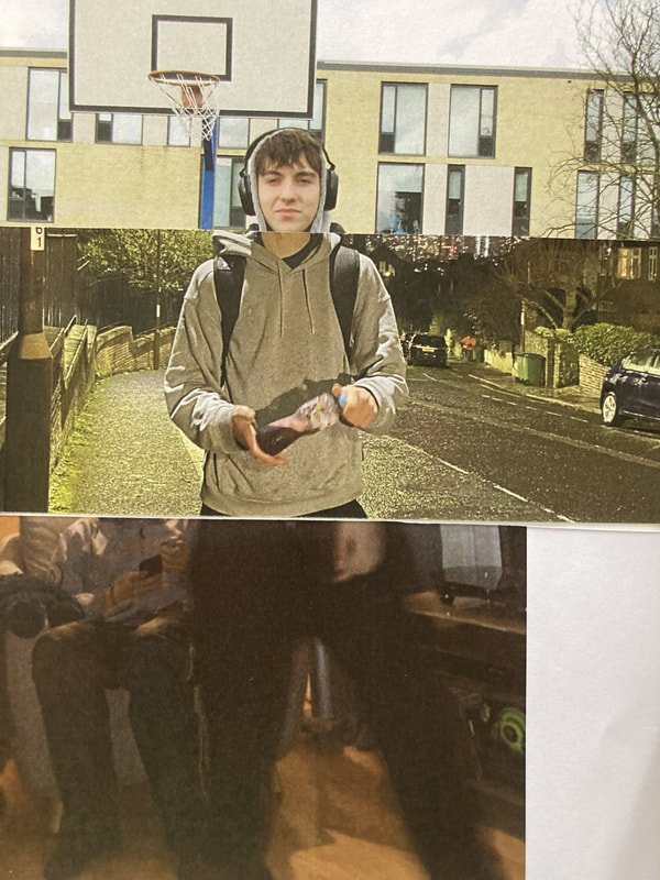
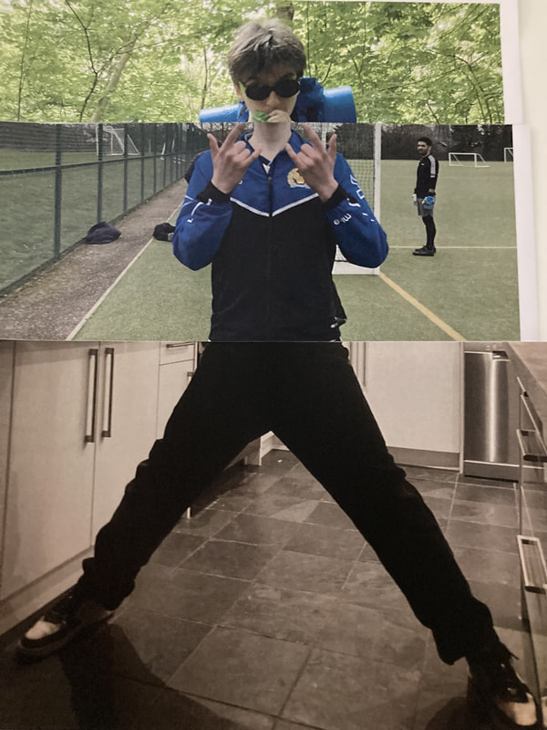
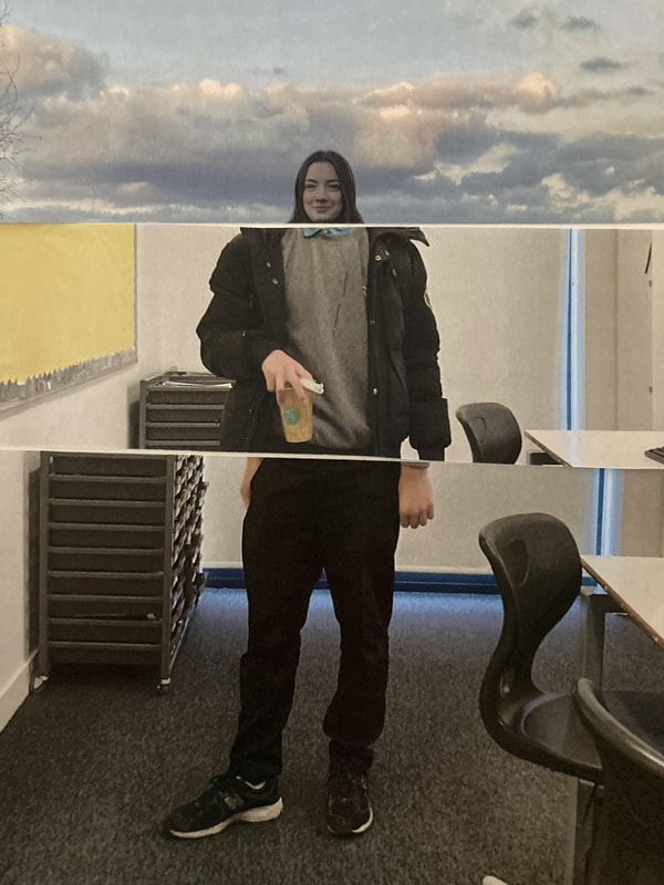
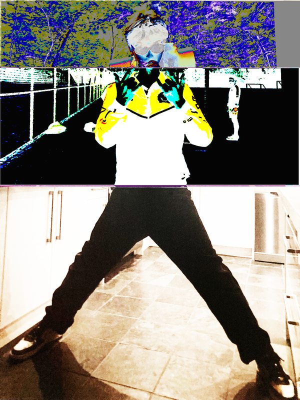
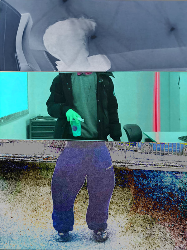
My second attempt at splitting my images in this way came with similar photos I had used previously however fragmenting them in a different way. What I wanted to achieve in this experiment was developing more of a defined figure in the works but still using sections from two different images. I achieved this by extracting specific sections/body structures from both images and morphing them together. I also used the roll cutting machine to similarly cut my 5 cm sections and did this twice over for both images. I think I achieved my aims well for this work as the structures were more visible however next time I want to be more precise with my lines connecting as for certain point this isn't well done due to me rushing and not properly checking before taking the photos. I also thought this brought back the child-like aspect of my exquisite corpses which I liked and linked back to my original work.
Thatching
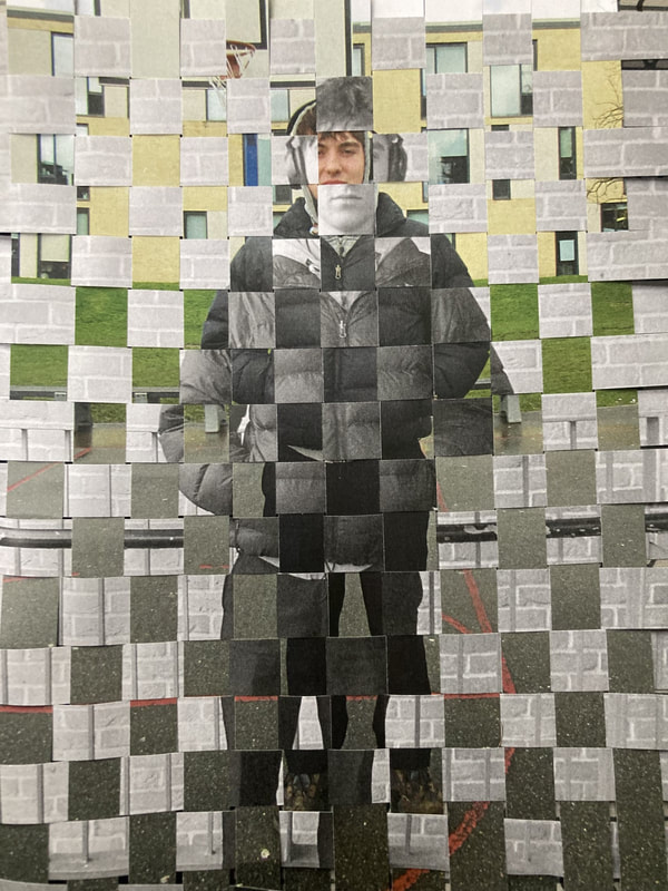
|
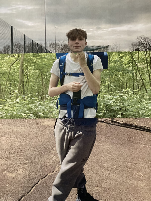
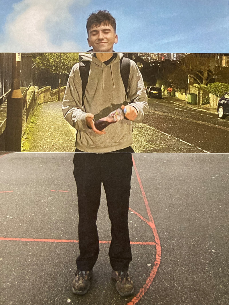
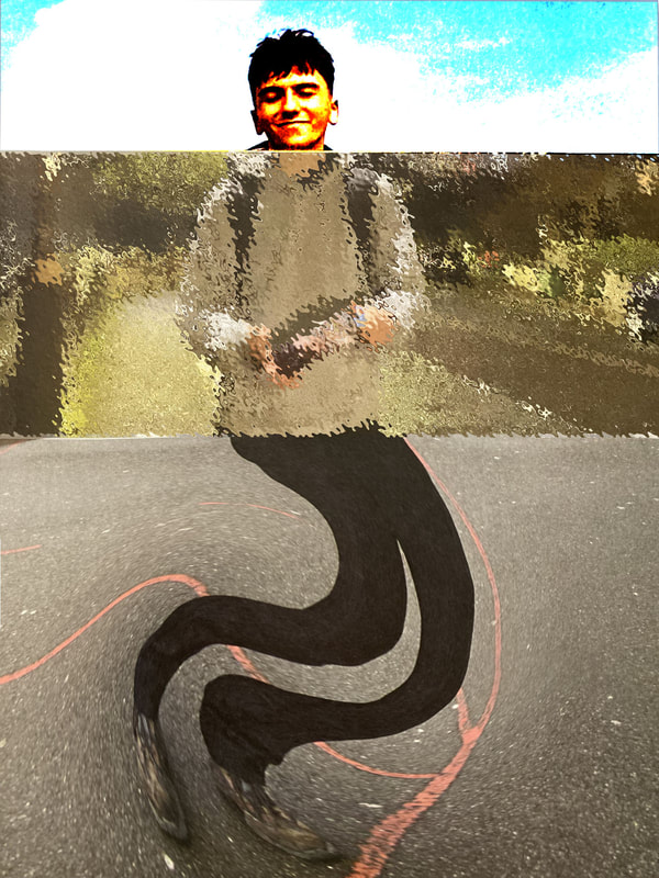
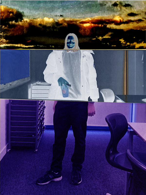
After a successful attempt to fragment work with smaller sections of a picture i wanted to interweave two images even more so they become one. With this piece of work I instead used a black and white image mixed with a coloured image to use a differing contrast of colours. I used two photos taken on the same day with the same person with this process however I used these images as although its the same person the distance from the camera was different.
This process was achieved by cutting my two images with a roll cutter but leaving the ends of the photos so that it was all attached. To complete this thatching process I had to cut one of my photos landscape and another portrait. Once I had done this it was time to thatch my two images together. |
Shoreditch photowalk


